
Here's What I'd Change About Google Gemini Model UI
John Gruber’s reply to Casey Newton’s about Gemini’s model UI
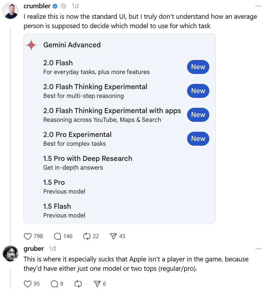
Casey Newton: I realize this is now the standard UI, but I truly don’t understand how an average person is supposed to decide which model to use for which task
John Gruber: This is where it especially sucks that Apple isn’t a player in the game, because they’d have either just one model or two tops (regular/pro).
Both of them are absolutely right, especially John Gruber, to some extent because we all know Apple would have what Joanna Stern suggests:
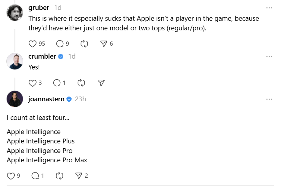
I count at least four…
Apple Intelligence, Apple Intelligence Plus, Apple Intelligence Pro, Apple Intelligence Pro Max
While Google engineers are likely working diligently on the Gemini models, it appears that product managers may have lost sight of user needs, or perhaps user feedback indicates a desire for an excessive number of features. Personally, I believe a simplified approach is best.
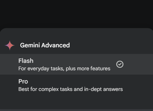
First, echoing John Gruber’s suggestion, there should be only two models. Let’s start with Flash. While I’m not entirely sold on the name, the model is certainly fast and lightweight (and presumably the least expensive to run), which aligns with the name’s implication. The “Experimental” models, both Flash and Pro, should be accessible via an opt-in toggle in the settings. This keeps them out of the way for average users while still providing access for those who want them. If Gemini 2.0 Flash is available, the Gemini 1.5 Flash model should be discontinued. Maintaining multiple versions of the same model can lead to confusion and redundancy, hindering a clear user experience.
The Gemini Pro model should, as its name suggests, be the one that handles complex tasks and provides in-depth answers. I understand that the “in-depth answers” aspect is tied to the “Deep Research” feature (which allows users to delve deeper into a topic by providing additional context and sources), but in my experience with Gemini, I typically choose when I want to engage in deep research, and that feels like a “Pro-tier” experience. Again, the “Experimental” Pro model should be hidden behind the opt-in toggle in the settings, away from the average user. Here’s how this could be implemented on the Pixel 9 Pro.
