
Category: Apps
You are viewing all posts from this category, beginning with the most recent.
My app is coming along! It’s actually really fun crowdsourcing tips and ideas. I really love the Android Dev community! Ass suggested. I’ll be working on the pages next. Polish will come way later when it’s ready for publishing on the Play Store. 😁
This makes me even more excited about Google I/O!
Google Says to Merge Your Fitbit
I received the following email from Google Fitbit:
“You are receiving this email because there is an important upcoming change to your Fitbit account and action is required.
As we have previously shared, Fitbit is now a part of Google, and Fitbit Account holders will need to transition to Google Accounts to continue using Fitbit. If you want to keep using Fitbit, you must move to a Google Account by 2 February 2026. If you use a Gmail account to sign in to Fitbit, you must also move to a Google Account. Learn more.
If you do not move to a Google Account by the deadline, you will not be able to continue using the Fitbit service. Your historical data will not be retained beyond 2 February 2026 (except as needed to comply with laws), and your account and data will be deleted.
To move to a Google Account, open the Fitbit app, go to app settings, and look for the option to move Fitbit to your Google Account (you may need to update the app in order to continue). You can also download or delete your data anytime on or before 2 February 2026.
You can learn more here.
I’ve already migrated my data, but many people are hesitant, waiting on seeing how Google handles the merge. So far, I’ve noticed that Google has gone out of their way to mitigate any wrongful assumptions. Google has explicitly stated that they won’t use user health data for selling ads or sell data at all.
Google’s reputation with user data has been consistent with its transparency and control stance, giving users full control over their data.
Fitbit App Update Causes Inaccurate Pace and Lap Data, Frustrating Users
A recent update to the Fitbit app appears to have introduced a significant bug affecting how exercise data, specifically pace and lap information, is displayed. Users have taken to the Fitbit community forums to voice their frustration over wildly inaccurate metrics showing up after their workouts.
The issue gained traction last year in a thread titled “Pace/Lap display in Exercise”, where the original poster described a confusing discrepancy:
From Jdmcb66: “I have a Charge 6 and Iphone and within the past few days my laps/pace on my exercise details page has gone crazy. I walked tonight, 2.23 Miles at average 19' pace. The detail at the bottom says Lap 1 - 11'41”/mi = 3.63 miles. I know my laps are set at 1.0 mi. I have gone back and earlier exercises that had lap1, lap 2, etc… now have similar one lap with ludicrous distances and no individual laps. This makes me nuts, as a runner I want to know what my lap times are for training and improvement."
Investigating the forum thread reveals this isn’t an isolated incident affecting only one type of device pairing. Comments pour in from a mix of users, including longtime Fitbit device runners using iPhones and newer users pairing Pixel Watches with Pixel phones. The common denominator is the Fitbit app exhibiting incorrect calculations, consolidating multiple laps into one inaccurate entry and misreporting distances and paces.
This problem was highlighted to me recently within the Pixel Superfan community. One member expressed their disappointment quite directly:
“So the fitbit app is now useless for tracking exercise because they are doing incorrect unit conversions."
For users who rely on detailed lap splits and accurate pace information for training purposes, this bug renders a core function of the Fitbit experience unreliable. While Fitbit moderators have acknowledged the issue and yesterday said for users to update their Fitbit app to the latest update available (4.38 or higher) to receive the fix, but users are still seeing the issue and are eagerly await a fix to restore accurate exercise tracking. For Google to position the Pixel Watch 3 with pace and laptop tracking to be the device for runners, Google needs to get this right before users switch to competing fitness trackers.
Why Google Meet Was Perfect for Setting Up My Parents' Google Voice
I recently did a Google Meet call with my parents to help them set up their Google Voice number system for their Church Ministry and it was such a seamless experience.
Here are a few things I absolutely loved:
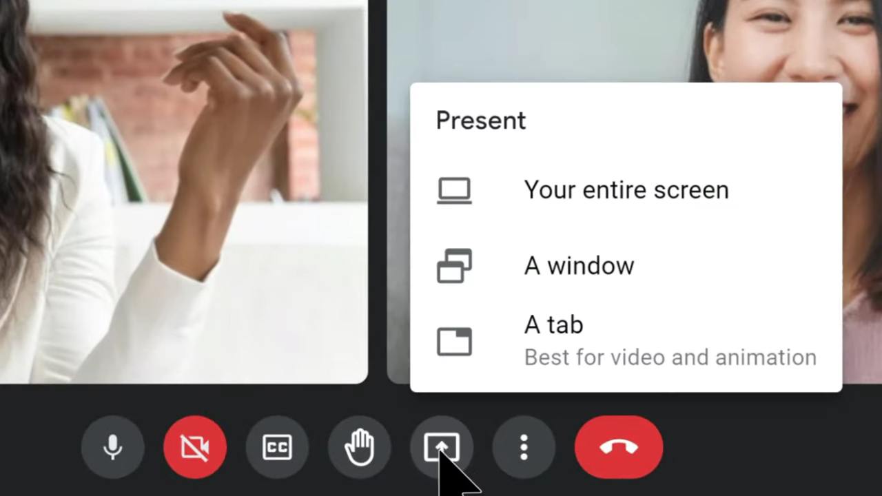
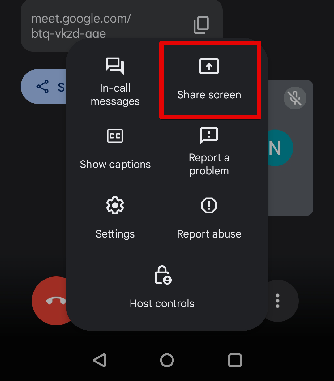
‘Share Screen’ on Google Meet
Being able to see what’s on my parent’s screen to walk them through setting up their Google Voice number worked wonders. I could have just used Chrome Remote Desktop (CRM) and took control of their mouse with their permission to set it up for them, but I wanted them to learn it on their own with my guided instructions. I’ve used CRM in the past and that too works great.
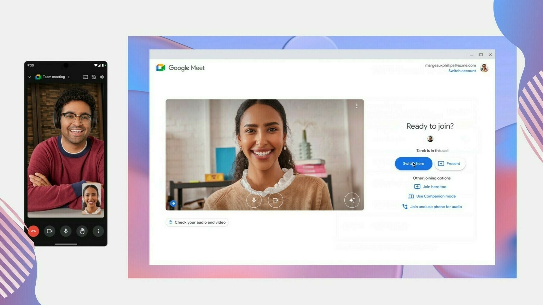
Google Meet ‘Switch Here’
Being able to quickly switch between Chrome and Android devices is so seamless, my 70 year old dad was able to do it. After I walked him through setting up his Google Voice number on the computer, I wanted to walk him through installing Google Voice on his Android phone. I told him to “join the meeting on your phone” and he noticed the “Switch Here” icon. Tapping on that brought him right into the call, quickly removing himself from the call on the computer and adding him back on his phone. That way we could do another Share Screen from his Android phone.
Google’s Material Design Language
Something so subtle, but incredibly intuitive is Google’s cohesive icons and material design language. Because my parents have been using an Android device for at least a decade now, they are familiar with the Google Material Design icons. Telling them to “tap on the settings icon”, “tap on the messages icon” or “tap the menu icon”, they immediately know I’m referring to the “gear icon”, “the message bubble icon”, and the “three dots”.

It’s great experiences like this that let me know I made the right choice in providing my parents with an affordable Chromebook and Android device now that they are retired. They get so much done without having to break the bank with the peace of mind of speed, simplicity, and security with their devices. Especially since they are the envy of their friends because of their Pixel’s “Call Screening” feature.
Material You and i...OS
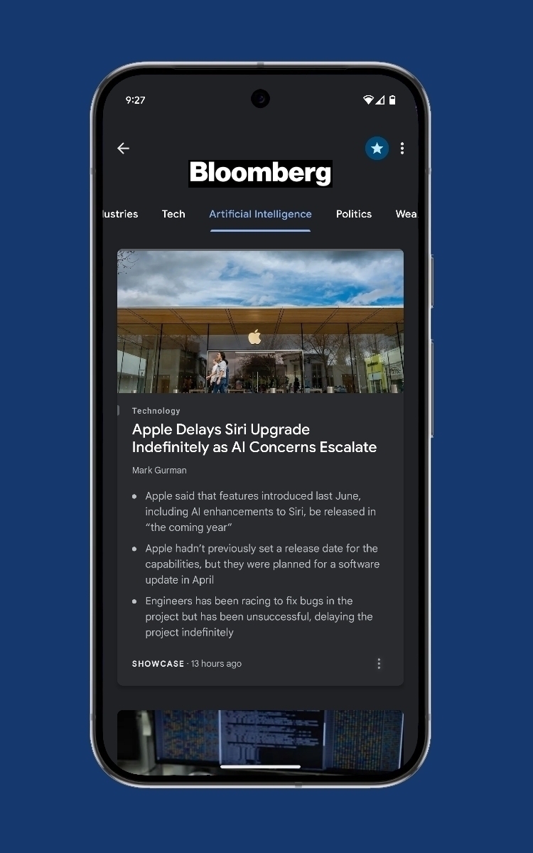
Reports are that Apple is bringing a radically new design to iOS with iOS 19.
Mark Gurman, on Bloomberg’s Power Up
“The revamp — due later this year — will fundamentally change the look of the operating systems and make Apple’s various software platforms more consistent, according to people familiar with the effort. That includes updating the style of icons, menus, apps, windows and system buttons.
As part of the push, the company is working to simplify the way users navigate and control their devices, said the people, who asked not to be identified because the project hasn’t been announced. The design is loosely based on the Vision Pro’s software”
Designer Eli Johnson made a brilliant concept of what that iOS redesign could look like based off of the design of the current Apple Photos, Sports, and Invites app that was recently released. Even Jon Prosser, popular Apple leaker, on Front Page Tech leaked a vision of what he saw as the new Camera app design on iOS 19.
Personally, I welcome it and I’m looking forward to this new era of UI from Apple because it’s a long time coming.
Since I’ve been working on my own app for Android, I’ve been paying more attention to the front end app designs. I’m sure it’s not a surprise, but though I do like Apple’s new glass-like visionOS and what Apple plans to do with their OSes across the Apple space, I’ve realized how much I enjoy Google’s joyful and human Material Design.
Aside from material design not compromising form or function, it just feels more joyful and human to use compared to Apple’s more cold, yet utopian sci-fi leaning design.
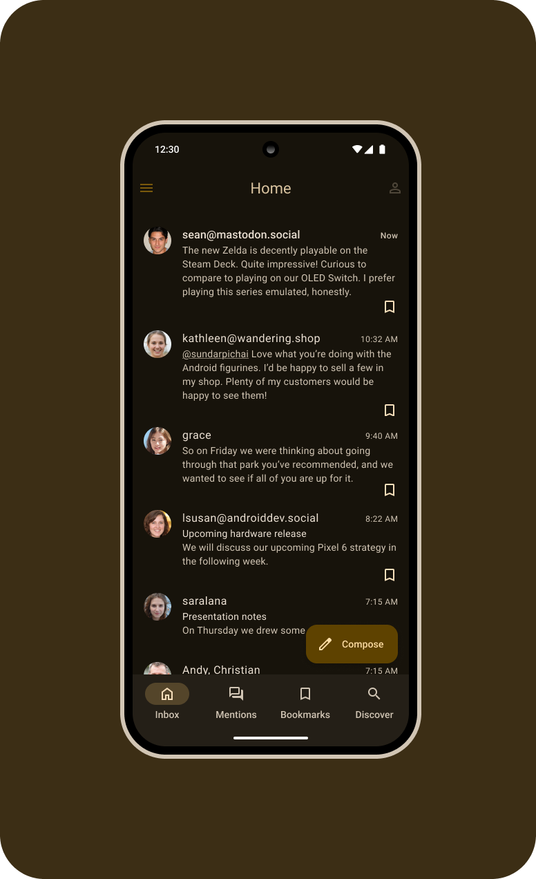
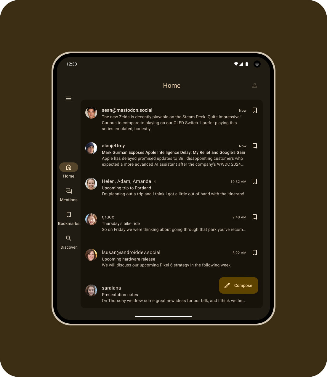
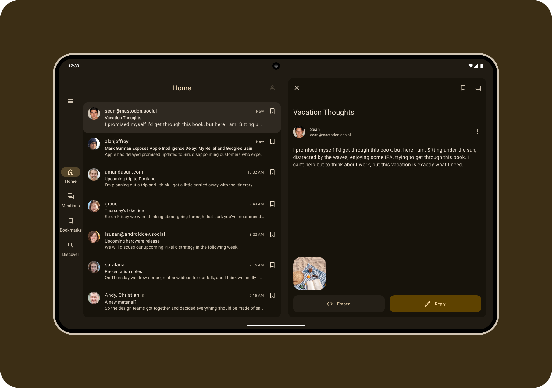
Okay, just finished the Home page design of the Micro.blog client app for Android for mobile and foldable/tablets.
I don’t know if I should bother making the other pages since they will all just be recycled views. I kind of want to go ahead and jump right into developing it now 😅
Bluesky's 2025 AT Protocol Roadmap: Enhanced Privacy and Developer Tools
Bluesky has just unveiled its 2025 roadmap for the AT Protocol, outlining some pretty significant changes aimed at making the platform smoother and more secure. Essentially, they’re fine-tuning the entire system. A key focus is on streamlining data synchronization with the Sync v1.1 update, which will make running relays more efficient and clarify the process for validating the firehose. Think of it as optimizing the backbone of the network, ensuring everything runs smoothly. As someone who’s been exploring both AT Protocol and ActivityPub clients, I’m particularly interested in seeing how these improvements will help bridge the gap towards a truly functional fediverse. Currently, ActivityPub boasts a larger ecosystem of clients and more established connectivity.
Security is also a major priority, with the introduction of Auth Scopes. This feature will give users much more granular control over app permissions. For example, you’ll be able to allow an app to read your posts without granting access to your direct messages. It’s about putting you firmly in the driver’s seat when it comes to your data. Developers are getting some love too, with a new web interface for PDS account management. This will simplify the process of building apps on the AT Protocol, making it easier for new users to sign up and manage their accounts.
Bluesky is also prioritizing the development of features for private groups and encrypted messages. They’re aiming to enable users to share content with specific audiences and keep it truly private, addressing a major demand for enhanced privacy. They’re also cleaning up the protocol by deprecating older features, ensuring everyone is using the latest and most efficient tools.
We believe that robust support for group-private data will be necessary for the long-term success of the protocol (and for apps built on the protocol). Similarly, the ability to share private content with a specific group or audience continues to be a top feature request for both the AT Protocol and the Bluesky app. Just as we’re currently doing with public conversation on the Bluesky app and the AT Protocol, we also want to co-design the protocol specification for private data in tandem with specific real-world product features: this results in better outcomes for both. Designing for privacy is pretty different from designing for global broadcast, and we think the data architecture will probably look pretty different from the MST + firehose system.
Shared data will depend on Auth Scopes, and we don’t expect to start design work until that is complete.
Looking forward, we continue to have plans to implement on-protocol DMs and E2EE group chat. However, we don’t expect to start work on this until after shared data is implemented. Meanwhile, there has been exciting progress in the broader tech world around the Messaging Layer Security (MLS) standard, and we are optimistic that we will be able to build on reusable components and design patterns when the time comes. It is also possible (and exciting!) that the atproto dev community will experiment and build E2EE chat apps off-protocol before there is an official specification.
The AT Protocol community continues to grow rapidly, and Bluesky encourages everyone to get involved through GitHub discussions and community events. It’s a collaborative effort, and the company is clearly committed to building a robust and user-friendly decentralized social network. I’m keen to see if these updates will allow the AT Protocol to catch up to ActivityPub’s current strengths in client diversity and network connectivity.
My Mom is Going to Love Scam Detection
Aisha Sharif, Product Manager, Pixel Phone on The Keyword
Scam Detection for phone calls, powered by Gemini Nano, protects you from fraud with on-device AI while keeping your conversations private to you. This Pixel-exclusive feature detects conversation patterns in calls commonly used by scammers in real time and will notify you if it senses anything suspicious.
And Scam Detection is now available in Google Messages, too. It uses on-device AI to flag conversational text patterns commonly associated with scams, so it can identify messages that seem harmless, but turn dangerous over time. You’ll receive a real-time warning so you can easily block and report the conversation.
My mom recently retired and if there’s one thing that raises her stress level it’s scammers. I bought her a Pixel 8a this last year, after having a Pixel 5 for some time, and she absolutely loves Call Screening and the Spam detection features in the phone app. Just the other day she sent me a screenshot of an E-ZPass texting scam that has been going around. She almost fell victim to it because E-ZPass is an actual highway toll system that is within her area. Thankfully, she didn’t respond to it or click the link, but now that Scam Detection is coming to Google Messages, my mom will now get a large badge alerting her that this message was a Scam.
More from the Google Online Security Blog:
Scam Detection in Google Messages uses powerful Google AI to proactively address conversational scams by providing real-time detection even after initial messages are received. When the on-device AI detects a suspicious pattern in SMS, MMS, and RCS messages, users will now get a message warning of a likely scam with an option to dismiss or report and block the sender.
As part of the Spam Protection setting, Scam Detection on Google Messages is on by default and only applies to conversations with non-contacts. Your privacy is protected with Scam Detection in Google Messages, with all message processing remaining on-device. Your conversations remain private to you; if you choose to report a conversation to help reduce widespread spam, only sender details and recent messages with that sender are shared with Google and carriers.
Scam Detection is only available in English in the U.S., U.K. and Canada and will expand to more countries soon.
Also, something I also found interesting is that a cybersecurity firm, conducted a funded evaluation of fraud protection features on a number of smartphones and found that Android smartphones, led by the Pixel 9 Pro, scored highest for built-in security features and anti-fraud efficacy. The full report is in a PDF.
What do you use for RSS?
I’ve been using Twine - RSS Reader for a little over 6 months now and have been loving it. Especially since it uses the proper Material UI on Android.